


Decisions on negative presentation.
A JOURNEY INTO THE VIRTUAL WORLD #5

If you haven’t yet read my previous post on my photographic adventures within the virtual world, feel free to pop back after you’ve caught up - we may resume afterwards.

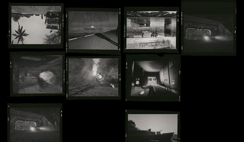
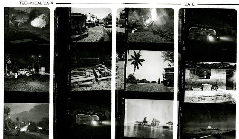
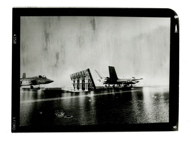
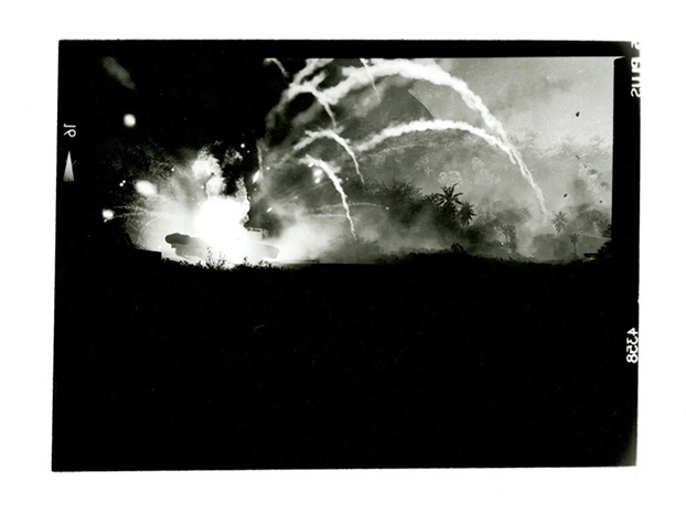
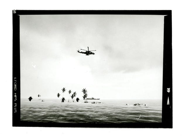
In the last post we looked at how videogame assets have been utilised in real world reporting, and how easily this can happen. We don’t know for sure whether these were accidents, idiocy, ignorance, a lack of respect for the subject matter, or whatever else, but what we do know is that aspects of videogames and virtual worlds are real enough to make the leap into, and corrupt the news. In the examples put forth in the last post, the issues were minor, but they could have easily impacted real world events, and this is something to be mindful of, and luckily proves the worth of the work I am trying to create. Can imagery derived from a virtual world be seen as real? Well, yes, according to the news. With that in mind, I continued my experimentations with image processing, creating a new set of images on 120 film. These photographs were getting close to what I had in mind, but I still wasn’t sure on then. I initially created a set of 10x8 prints, however these were rather unfortunately too large, revealing the aliasing within the scene created in the game engine. I did however like the inclusion of the film border and I subsequently scaled down the images so that they took up a smaller portion of the page. The use of white space around the images, along with the retention of detail within the smaller image yielded better results, and when the prints were observed, showed a believable representation of what could be seen as an authentic piece of photography from a conflict.
“Computers had their origin in military cryptography—in a sense, every computer game represents the commandeering of a military code-breaking apparatus for purposes of human expression.” - Austin Grossman
I was happy for a time with the state of the images, and I was also happy with the source image, but I was unsure whether to use the black and white darkroom prints I had just produces, or to go back to the colour polaroids, or perhaps something else entirely? My main concern with the project was that of the final presentation, of the delicacy of the work, and how I might present it in whatever form it would finally take. I had thought to present the work in several ways, making use of certain conventional methods, such as framed work on a wall. A tried a true method, to be sure, but I felt as though I could create a more compelling experience for the viewer with a little creativity. I was considering the use of the aforementioned 120 film prints, the polaroid images, and contact sheets all together. Along with this, I also thought that the inclusion of an additional visual and aural element, such as playing projected imagery or footage captured within the engine within which my images derived, or perhaps playing sounds of war, such as gunfire, explosions, nature, and vehicles for the viewer as they examined the work. I had thought too that the inclusion of appropriate newspaper article cut-outs, quotes, and poetry could be intertwined within the presentation, adding layers upon layers to obfuscate the origins of the images. I had also thought that the inclusion of new real-world images created with a similar aesthetic could also be incorporated into the exhibition too, as well as objects such as bullet casings, dog tags, or other miscellaneous military ephemera and artefacts.
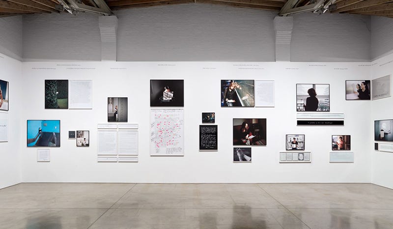
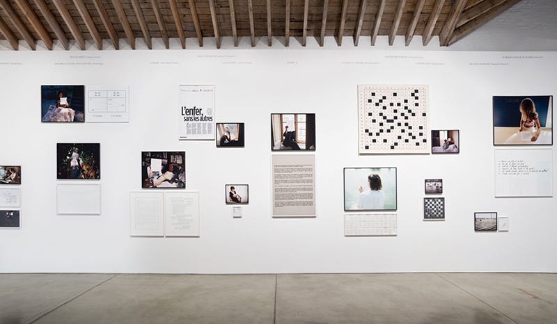
I felt as though all of these possibilities could be of value in enhancing the experience, however, I was also aware that sometimes a simpler presentation can be better, and might perhaps bestow more dignity to the work, considering the subject matter at the heart of it. With all this in mind, I decided that it would be pertinent to do some research into how other artists have presented their work. One artist in particular that I looked at was Sophie Calle, specifically her project ‘Take Care of Yourself’, which was presented in a rather unique manner. Her project deals with fiction represented as truth, and her exhibition of the aforementioned work combines text and imagery, differing the sizes of each to create an intriguing wall of imagery and documents that draws the eye rather expertly. My research into exhibition practices and the art of presentation led me to many different artists, but ultimately, the process I’d choose had to work for the project, rather than the other way around.
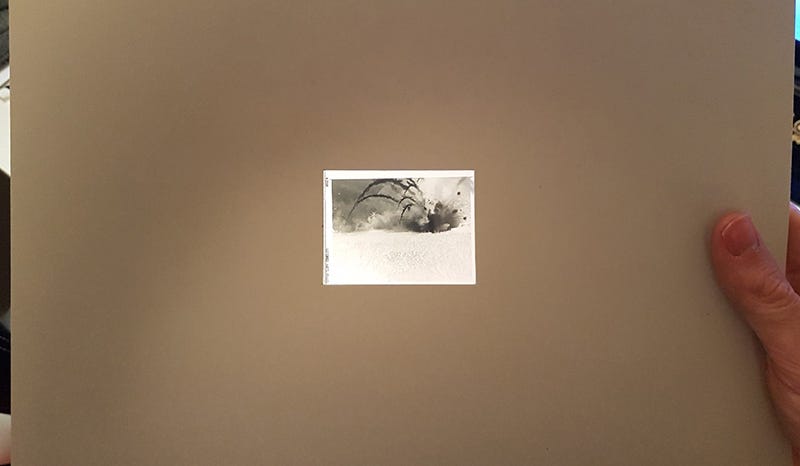
After considering the work that I had produced so far and keeping the ideas of a unique exhibition display such as Calle’s, I decided to revert to an earlier stage, to create displayable work using the 120 negatives themselves, rather than the collection of darkroom prints I had made. In a similar way to how the larger prints showed evidence of aliasing within the game engine, and the subsequent scaling back in the second set of prints I made decreased this somewhat, I decided scale back to the most minimal form. I did think too that perhaps returning to 35mm film at this point would suit better, but dealing with imagery on such a small scale would bring up other issues and thus I decided to remain with the 120, it being small enough to make the details seem real, but large enough for the average viewer to recognise the content.
With the decision to use a smaller scale set I felt a new confidence in the work, and that it would make the viewer examine the project/images more closely, giving them time to ponder over each scene of conflict. This use of the negatives would also indicate two truths about the work, firstly the negative would, by the very use of the word by which it is associated, convey the negativity of war. And secondly, the transparent nature of the film would convey the fact that the viewer must look through the work, to look deeper into the imagery to discover its message and the truth of its origins, and an astute viewer could perhaps see though the masquerade of reality and peer into the virtual world.
“Logicians tell us that two Negatives make an Affirmative. Will somebody say how many Negatives make a Photographer?” - Anonymous
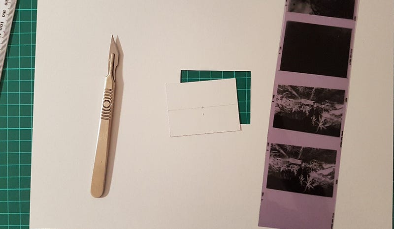
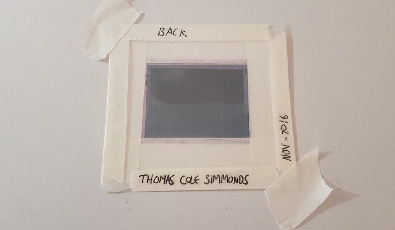
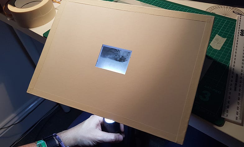
With a decision made on the form that the work would take, I then had to decide how to physically present the work, as simple framing would not work unless backlit I felt too that handling the work as a tangible object would lend credence to the images, and thus, I wanted to create something that could be touched, but not at the expense of the negatives themselves. The process of creating a displayable negative in a manner which would protect it from damage was relatively simple, at least initially. Before making any permanent solutions, I decided to make a temporary device as a proof of concept. Firstly, I cut a template as a rough guide to the size of the border I wanted around the negatives, creating two to sandwich the negative between. That in and of itself would do little to protect the work however, other than making it easier to move without risking fingerprints on the film. In order to protect from dust and scratches, as well as accidental touching, I used sheets of clear acetate between the template and the film on either side. Once in place, I temporarily bound the film, acetate, and templates together using masking tape.
With the creation of the prototype for a new object for display I decided to shoot another set of images to bolster the collection. Although I was happy with what I had already produced, I felt the selection could be stronger and that it would be prudent to have more than I required, allowing, if I wanted, the creation of themed sets or complementary or contrasting imagery. This of course meant returning to the game and further exploring, putting on my virtual photographer hat again. This took some time, but I eventually captured enough appropriate scenes. I once again set up the camera in front of the telly and shot another roll of 120. After developing, I also produced another set of prints. I knew that I wouldn’t be using them in the presentation, but I also wanted to scrutinise the images properly before committing to using them and seeing them as large prints meant that I could judge them by their composition and detail, even though the quality of the image would be lessened at scale. Along with the critical reasoning, I also wanted to create a matching set to the previous roll for posterity’s sake. Once I was happy with my selection, and after scanning the negatives for backup, I proceeded to cut them out into individuals and to begin work on housing them within mountboard frames… but more on that in the next post!
Calle, S. (2007) Take care of yourself. Arles: Actes Sud.
GROSSMAN, A. (no date) in You. GEEKTOPIA.
Henisch, H.K. and Henisch, B.A. (1998) in Positive pleasures: Early photography and humor. University Park: Pennsylvania State University Press, pp. 59–60.
Sophie Calle (no date) Paula Cooper Gallery. Available at: https://www.paulacoopergallery.com/exhibitions/sophie-calle2 (Accessed: 10 July 2023).
So, I finally made a decision on how the images would be seen in their final form, and I settled on the means by which they would be presented, although only in rough. We’ll look at how the work progresses in the next post, but in the meantime let me know if you have any thoughts on the project so far!
And as always, thank you for reading. If you’d like to support the blog, you can do so over on Patreon, or by subscribing and sharing!